

- Media library
- Question limits
- Creating a survey from MS Word doc
- How to edit live surveys
- Survey blocks
- Survey block randomizer
- Question randomization
- Scale Library
- What is monadic testing?
- What is sequential monadic testing?
- Extraction Support for Image Chooser Question Types
- What is comparison testing?
- Custom validation messages
- Survey Builder with QuestionPro AI
- Testing Send
- Survey Preview Options
- Add Questions From a Document
- Survey Authoring 2025
- Getting Started Test
- Standard question types
- Multiple choice question type
- Text question- comment box
- Matrix multi-point scales question type
- Rank order question
- Smiley-rating question
- Image question type
- Date and time question type
- reCAPTCHA question type
- Net Promoter Score question type
- Van Westendorp's price sensitivity question
- Choice modelling questions
- Side-By-Side matrix question
- Homunculus question type
- Predictive answer options
- Presentation text questions
- Multiple choice: select one
- Multiple choice: select many
- Page timer
- Contact information question
- Matrix multi-select question
- Matrix spreadsheet question
- Closed card sorting question
- Flex Matrix
- Text Slider Question Type
- Graphical Rating Scales
- Rank Order - Drag and Drop
- Bipolar Matrix - Slider
- Bipolar Matrix Likert Scale
- Gabor Granger
- Verified Digital Signature
- Star Rating Question Type
- Push to social
- Attach Upload File Question
- Constant Sum Question
- Video Insights
- Platform connect
- Communities Recruitment
- TubePulse
- Open Card Sorting
- Map Question Type
- VideoAI
- Answer type
- Reorder questions
- Question tips
- Text box next to question
- Text question settings
- Adding other option
- Matrix question settings
- Image rating question settings
- Scale options for numeric slider question
- Constant sum question settings
- Setting default answer option
- Exclusive option for multiple choice questions
- Validate question
- Bulk validation settings
- Remove validation message
- Question separators
- Question Code
- Page breaks in survey
- Survey introduction with acceptance checkbox
- RegEx Validation
- Question Library
- Embed Media
- Slider Start Position
- Answer Display - Alternate Flip
- Matrix - Auto Focus Mode
- Text validations
- Numeric Input Settings- Spreadsheet
- Answer Groups
- Hidden Questions
- Decimal Separator Currency Format
- Allow Multiple Files - Attache/Upload Question Type
- Text box - Keyboard input type
- Deep Dive
- Answer Display Order
- Alternate colors
- Conjoint Best Practices
- Multi-media file limits
- Conjoint Prohibited Pairs
- Carousel Layout for Matrix Questions
- Add logo to survey
- Custom Themes
- Display Settings
- Auto-advance
- Progress bar
- Automatic question numbering option
- Enabling social network toolbar
- Browser Title
- Print or export to PDF, DOC
- Survey Navigation Buttons
- Accessible Theme
- Back and Exit Navigation Buttons
- Focus Mode
- Survey Layout
- Survey Layout - Visual
- Telly Integration
- Telly Integration
- Workspace URL
- Classic Layout
- Branching - Skip Logic
- Compound Branching
- Compound or delayed branching
- Response Based Quota Control
- Dynamic text or comment boxes
- Extraction logic
- Show or hide question logic
- Dynamic show or hide
- Scoring logic
- Net promoter scoring model
- Piping text
- Survey chaining
- Looping logic
- Branching to terminate survey
- Logic operators
- Selected N of M logic
- JavaScript Logic Syntax Reference
- Block Flow
- Block Looping
- Scoring Engine: Syntax Reference
- Always Extract and Never Extract Logic
- Matrix Extraction
- Locked Extraction
- Dynamic Custom Variable Update
- Advanced Randomization
- Custom Scripting Examples
- Survey Logic Builder - AI
- Custom Scripting - Custom Logic Engine Question
- Survey settings
- Save & continue
- Anti Ballot Box Stuffing (ABBS) - disable multiple responses
- Deactivate survey
- Admin confirmation email
- Action alerts
- Survey timeout
- Finish options
- Spotlight report
- Print survey response
- Search and replace
- Survey Timer
- Allowing multiple respondents from the same device
- Text Input Size Settings
- Admin Confirmation Emails
- Survey Close Date
- Respondent Location Data
- Review Mode
- Review, Edit and Print Responses
- Geo coding
- Dynamic Progress Bar
- Response Quota
- Age Verification
- Tools - Survey Options
- Live survey URL
- Customize survey URL
- Create email invitation
- Personalizing emails
- Email invitation settings
- Email list filter
- Survey reminders
- Export batch
- Email status
- Spam index
- Send surveys via SMS
- Phone & paper
- Adding responses manually
- SMS Pricing
- Embedding Question In Email
- Deleting Email Lists
- Multilingual Survey Distribution
- SMTP
- Reply-To Email Address
- Domain Authentication
- Email Delivery Troubleshooting
- QR Code
- Email Delivery and Deliverability
- Survey Dashboard - Report
- Overall participant statistics
- Dropout analysis
- Pivot table
- Turf analysis
- Trend analysis
- Correlation analysis
- Survey comparison
- Gap analysis
- Mean calculation
- Weighted mean
- Cluster Analysis
- Dashboard filter
- Download Options - Dashboard
- HotSpot analysis
- Heatmap analysis
- Weighted Rank Order
- Cross-Tabulation Grouping Answer Options
- A/B Testing in QuestionPro Surveys
- Data Quality
- Data Quality Terminates
- Matrix Heatmap Chart
- Column proportions test
- Response Identifier
- TURF Reach Analysis
- Bulk Edit System Variables
- Weighting and balancing
- Conjoint analysis designs
- Conjoint part worths calculation
- Conjoint calculations and methodology
- Conjoint attribute importance
- Conjoint profiles
- Market segmentation simulator
- Conjoint brand premium and price elasticity
- What is MaxDiff scaling
- MaxDiff settings
- Anchored MaxDiff Analysis [BETA Release]
- MaxDiff FAQ
- MaxDiff- Interpreting Results
- Automatic email report
- Data quality - Patterned responses
- Data quality - gibberish words
- Import external data
- Download center
- Consolidate report
- Delete survey data
- Data quality - All checkboxes selected
- Exporting data to Word or Powerpoint
- Scheduled reports
- Datapad
- Notification Group
- Unselected Checkbox Representation
- Merge Data 2.0
- Plagiarism Detection
- IP based location data
- SPSS Export
- SPSS variable name
- Update user details
- Update time zone
- Teams
- Add Users
- Usage dashboard
- Single user license
- License restrictions
- Troubleshooting login issues
- Software support package
- Welcome Email
- User Roles & Permissions
- Bulk Add Users
- Two-Factor Authentication
- Network Access
- Changing ownership of the survey
- Unable to access Chat support
- Navigating QuestionPro Products
- Agency Partnership Referral Program
- Response Limits

Gap/Perception Plot - Details
In a Side-By-Side Matrix question, the Gap/Perception Plot can be used to visually represent all the analytical data in a single chart. The details of one dimension (Importance etc.) are plotted on the Y axis and the details of the second dimension are plotted on the X axis.
How do I access the Gap/Perception Plot?
-
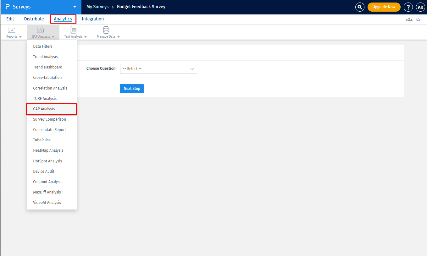
Go to:
- Login » Surveys » Analytics » GAP Analysis
- Click on GAP Analysis
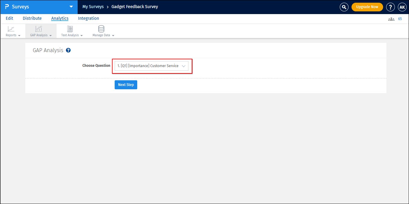
- Select the question to analyze from the available drop-down menu.
- Click on Next Step, and the GAP analysis charts will appear.
- You can obtain the online report or download the Excel, PPT or print the results.
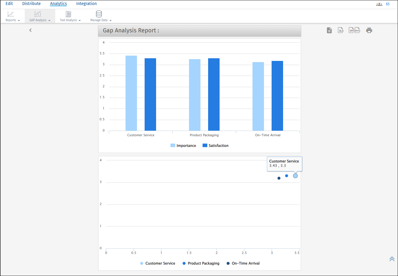
How do I read the charts?
The bar chart provides the mean for every dimension and the attribute. The plot is with respect to the mean on the Y-axis and attributes like Customer Service, Product Packaging and On-Time arrival on the X-axis. The second chart is a scatter plot that compares the dimensions based on the mean value of the attributes.
License
This feature is available with the following licenses :
You may also be interested in...
Side-By-Side Matrix Question
GAP Analysis - Introduction
Weighted Satisfaction Scoring
Gap/Perception Plot - Details